Wednesday, September 29, 2010
Friday, September 24, 2010

Wednesday, September 22, 2010
Sunday, September 12, 2010

Saturday, September 11, 2010
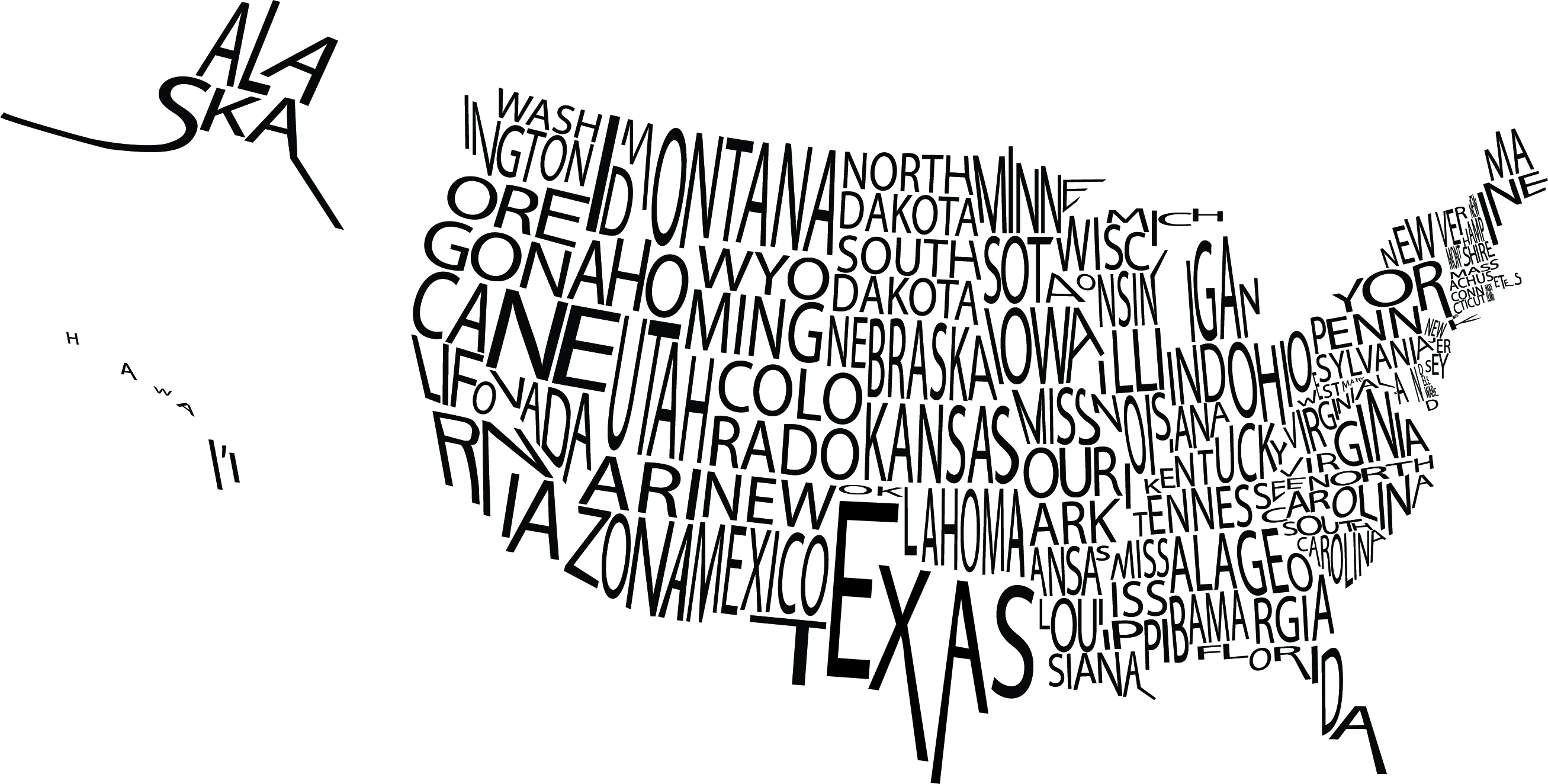
Why is the magic number in design class 15...?
15 compositions, 15 drawings. I think the number 15 divided by the number 3 would be a much better number for it.
Thursday, September 9, 2010
Tuesday, September 7, 2010
To me who are you?
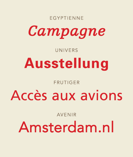 Adrian Frutiger, a typeface designer and a normal person. An artist. Switzerland, the son of a weaver by the age of 16 was working as a printer's apprentice near his home town. An escapist from the formal. He truly turned clear/concise letterforms into beautiful manipulations of the formality that we are all used to into 'truth' if truth could be conveyed in a typeface. He analyzed how type shape and geometry can effect human emotions in his book "Geometry of Feelings". He understood the effects of design on the mind, and he analyzed it and turned it into works that other designers can use to more effectively communicate thought, feeling, and emotion. He truly was a frontiersman in the world of type design. An educator a student a master and a wordsmith, that is Adrian Frutiger. (In a nutshell)
Univers, what makes it so special you may ask? Well I will tell you, it is clear concise and powerful. It stays clean while not being 'standard' by any means. The univers grid shows different widths and thicknesses of the font so that a designer can easily and effectively choose what message s/he wants to convey with his font choice
Subscribe to:
Posts (Atom)